Louise Owen Portfolio

Taste the Difference Discovery

APB

Taste the Difference Discovery

APB

The task was to create premium packaging for APB’s beef cuts, aligning with Sainsbury’s “Taste the Difference” brand while introducing an elevated look for their new “Discovery” subcategory. The packaging needed to retain key brand elements while enhancing the sense of luxury. A key requirement was to develop an engaging consumer experience that reflected premium quality, incorporating a new “Discovery” logo that expanded on the established “Taste the Difference” branding.

PACKAGING

LOGO

PACKAGING               LOGO

The design adhered to Sainsbury’s established “Taste the Difference” aesthetic, incorporating their deep purple colour and refined typography, with added gold accents to elevate the luxurious appeal. The packaging featured a window and flap combination, inviting consumers to interact with the product by revealing the premium steak, which added an element of discovery.

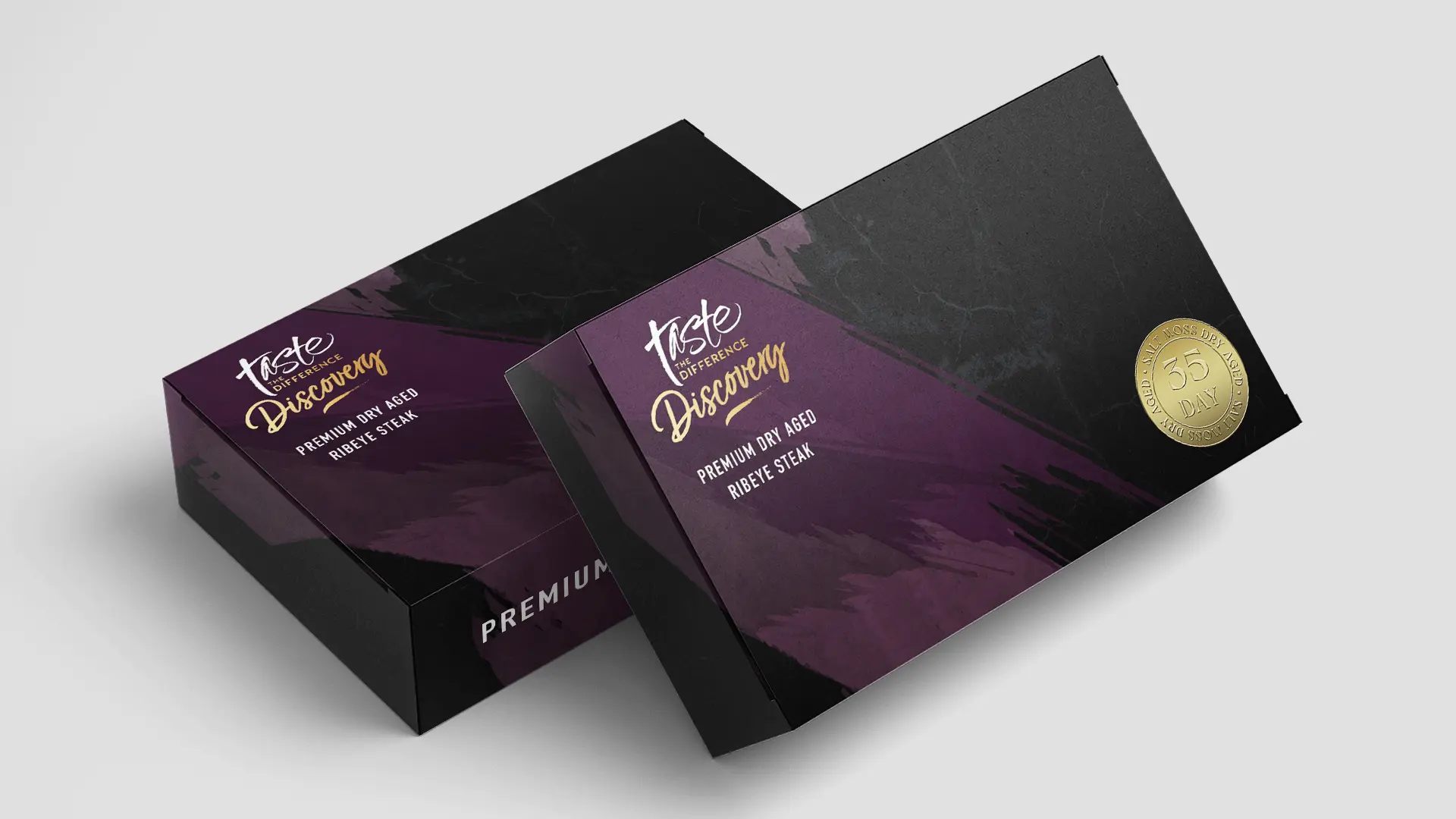
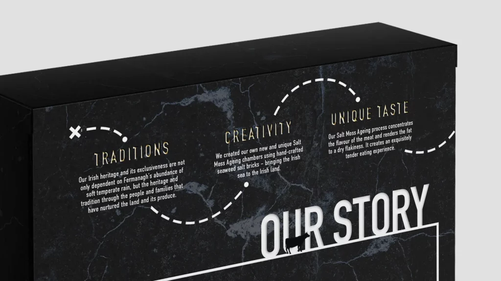
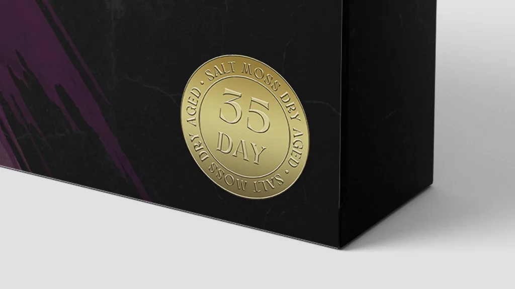
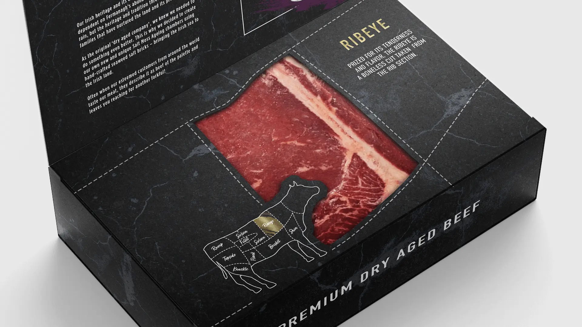
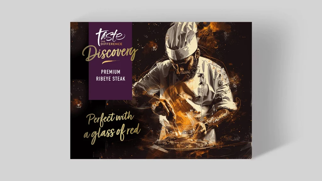
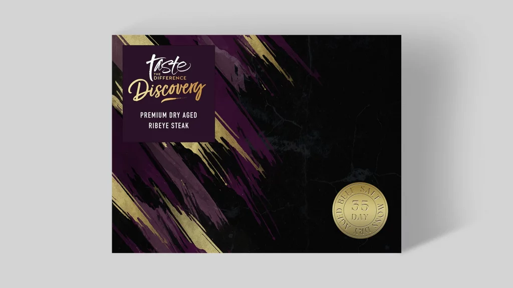
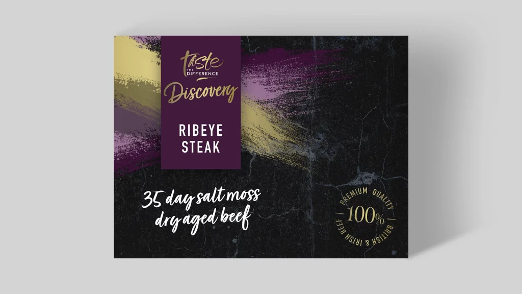
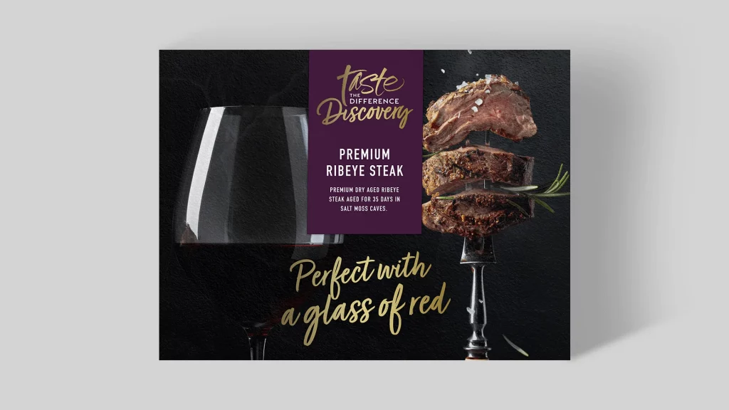
The new “Discovery” logo was created by integrating the well-known “Taste the Difference” logo with an elegant serif typeface for “Discovery,” effectively distinguishing the new range. The packaging combined brand consistency with enhanced visual features, creating a sophisticated shelf presence that drew attention. Rich colours, a clean layout, and tactile elements conveyed the premium quality of the product, positioning APB’s beef as a memorable part of Sainsbury’s premium offerings.